Design & Branding for supplier of tea and coffee
Sakha-Trade Distribution is the largest wholesale supplier of tea and coffee. As the company enters the international market, it decided to create a logo that reflects its growth and development — as well as the core of its business niche.

Design & Branding for wholesale supplier of tea and coffee: Goals & Objectives
Work Process
Our client aims to become the leader in quality and customer service in the wholesale trade market of the region. That’s why they needed a logo that would both elevate their brand image and reflect the national spirit of Yakutia.
Before starting work on the visual identity, we created a mood board that conveyed the national spirit of Yakutia through vibrant colors, native plants, feathers, and traditional amulets. This was done to capture the client’s vision and align on the right creative direction for the project moving forward.

The first logo represents a bold company aiming for new horizons. A soaring eagle in the sky serves as a symbol of leadership. The sun symbolizes the source of energy for all living things. The bird’s wing appears to complete the sun’s invisible rays — a metaphor for unity and partnership, reflecting the company’s openness to collaboration with new clients and partners.

Second Logo Option
The second concept represents a kind of planet where a tree is growing. It’s built from identical geometric shapes that repeat in a progressively smaller scale. These types of forms are often said to model themselves — just like our client, who channels all their energy into continuous growth and development.

Third Logo Option
The third concept incorporates elements of nature — the waves of the world’s oceans and the speed of the wind. Water evokes a sense of harmony, balance, and stability. The rising wave at the center of the logo symbolizes a growth chart. These types of elements and meanings work on a subconscious level, inspiring trust and confidence in the brand as a reliable partner.

Fourth Logo Option
In ancient times, trade began to develop using dog sleds — and in Yakutia, this mode of transport is still a valued tradition. That’s exactly what we chose to highlight in this concept.
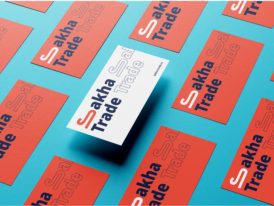
The letter “S” was transformed into a red sled, symbolizing bold movement — like the bright gear worn by a racer. The other colors represent transparency and integrity in working with SAKHA TRADE, while also evoking images of snow, ice, and the clear northern sky.

Fifth Logo Option
The fifth concept has a fairytale quality, with its central figure being a deer — a symbol of Yakutia closely associated with the sun, purity, creation, and the tree of life. The ornamental patterns in the logo reflect a deep connection to the region’s national culture and serve as a harmonious complement to the overall design.

Sixth Logo Option
When getting to know the client, we realized they approach their work with true passion and love. We reflected this in the sixth concept through the legend of the Edelweiss flower.
Long ago, a man had to find a rare flower—considered a symbol of love—to prove the sincerity of his feelings to his beloved. The Edelweiss grows high up in the mountains, and it was believed that only someone with true love in their heart could successfully pick the flower.

Results
Our team developed six different branding concept options. The client liked all of them but ultimately chose the fourth logo, which conveys purity and transparency in working with SAKHA TRADE.
Thanks to the well-crafted corporate identity, the brand has become more recognizable, enabling it to expand to the international market.

Schedule free marketing consultation
Learn how to stop wasting ad spend and turn marketing into real profit
Start growing your business today with WEB ALTERNATIVE
Ready to stop wasting budget and start seeing real ROI?
Tell us about your project — and get a free forecast